Modal component for Semantic-Ui
Vue-Semantic-Modal
A modal component for Semantic-Ui, no jQuery required, made with Vue.js.
The modal component has the following features.
Example
To start working with Vue-Semantic-Modal use yarn to install it in your project
yarn add vue-semantic-modal Import in your project
import modal from 'vue-semantic-modal'

export default {
  name: 'hello',
  components: {
    modal
  },
}
Include in the root component semantic-ui CSS:
@import '~dist/semantic.css'Declare reactive properties for your customized modal
  data () {
    return {
      closeOnClickAway: true,
      animationDuration: 500,
      showModal: false,
      confirmed: true
    }
  },
  methods: {
    confirm () {
      this.confirmed = true
      this.showModal = false
    }
  }
More about props which can be used are available here.
The markup for the modal is fairly simple.
<modal
    v-model="showModal"
    :animation-duration="animationDuration"
    :close-on-click-away="closeOnClickAway"
    >

    <p slot="header">Confirmation needed</p>

    <p slot="content">Do you want to continue?</p>

    <template slot="actions">
        <div class="ui black deny button"
            @click="showModal=false">
            No
        </div>
        <div class="ui positive right labeled icon button"
            @click="confirm">
            Yes
            <i class="checkmark icon"></i>
        </div>
    </template>
</modal>
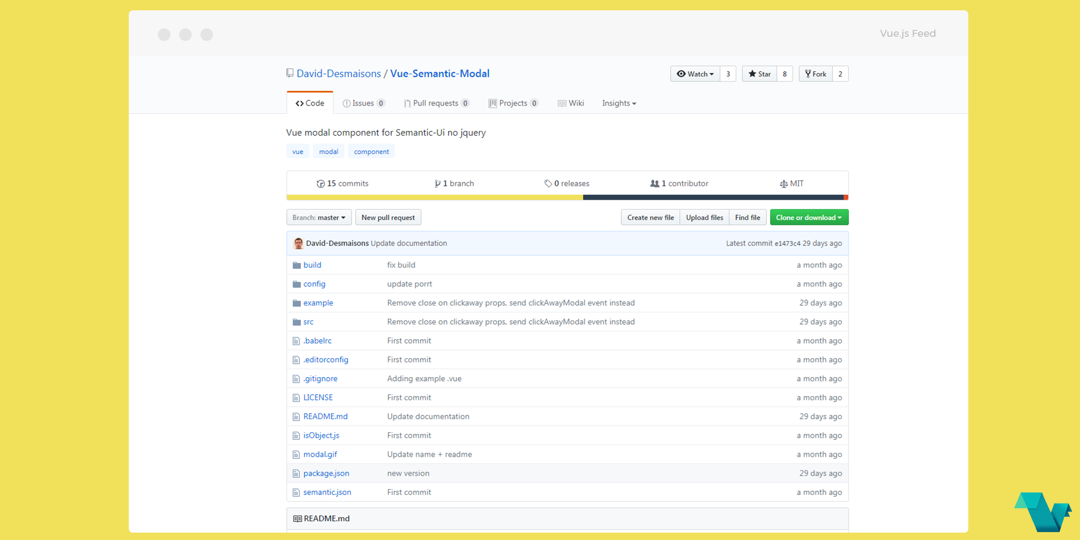
If you would like to find more about Vue-Semantic-Modal, head to the project's repository on GitHub, where you will also find the source code.


